

A vinyl record is not just sound but a visual object. In an era when albums were bought physically in stores, the sleeve played a huge role. It was the first thing that grabbed a potential buyer's attention, set the mood, promised a specific sonic experience. In Italo Disco, a distinct visual language of sleeves took shape that today is recognized as a separate branch of '80s graphic design.
Format Dictates Form
The key Italo Disco format is the 12-inch single. That's a square sleeve, 30 by 30 centimeters - big enough for the design to make an impression, and standard for the era's dance music.
Designers understood the sleeve would be seen in two main places: in a record store (standing among hundreds of others) and in a DJ's booth (where the next track gets picked fast). That meant it had to be visible, recognizable, functional.
Color - the Main Instrument
The '80s Italo Disco cover palette is memorable. Bright, saturated colors. Pink, blue, purple, bright green, neon yellow. Sometimes contrasting combinations (pink with black, blue with yellow). Sometimes gradients running from one bright color to another.
There were technical reasons for this, too. In a record store, a brightly colored sleeve stood out from competitors. From a few meters away, a buyer's eye would catch on a bright spot and they'd step closer. Pastel or muted tones lost that battle for attention.
Typography: Bigger, Bolder, Weirder
'80s typefaces deserve their own conversation. Italo Disco covers used bold, visible type with the era's signature features. Wide condensed letterforms. Italics with unusual angles. Decorative effects - drop shadows, neon outlines, metallic shine.
Artist names were often blown up - huge letters running the full width of the sleeve. Sometimes the name mattered more than the image. Sometimes the reverse - the image dominated and the name was placed neatly in a corner.
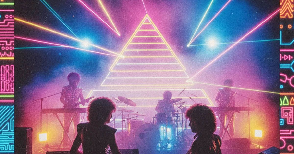
A specific move of the era was "chromatic" or "neon" typography, creating a glow effect. It matched the club aesthetic - neon signs, lasers, colored spotlights.
Illustration vs Photography
Italo Disco covers split into two broad types:
- Photographic. Artist portraits, video stills, studio shoots. Popular with solo performers, where the artist's face is the main asset.
- Illustrated. Abstract or semi-abstract images, graphics, artistic compositions. Typical of instrumental projects (Koto, Laserdance), concept artists, compilations.
Sometimes both approaches combined - a photo of the artist with graphic elements, processing, effects. That opened up more design possibilities.
Cosmic Aesthetics
A separate branch of Italo Disco covers is the cosmic one. Stars, planets, galaxies, futuristic landscapes. Typical of space-disco projects - Rockets, Koto, Laserdance and others.
Space was associated with the future, technology, electronic music. Synthesizers were perceived as "instruments from the future," and the cosmic aesthetic underlined that association. Today these covers are an important part of the genre's visual history and collectors value them highly.
Effects of the Era
'80s designers eagerly used signature graphic effects:
- Airbrush illustrations - smooth, almost photo-real paintings with a signature "airy" texture.
- Chromatic gradients - smooth transitions between colors.
- Grids and geometric patterns - a legacy of Memphis Group aesthetics and postmodernism.
Many of these effects are back in fashion now. Contemporary designers working in retro aesthetics are relearning '80s techniques and applying them in new contexts - film posters, current album artwork, advertising.
Italo Disco Designers
Unfortunately, the names of Italo Disco cover designers rarely reached the public. They were listed in small type on the back or not listed at all. Today researchers try to identify specific authors by stylistic traits - some masters left so many works that their handwriting is recognizable.
Some work was done by in-house design departments at the labels. Some by freelance illustrators and graphic designers. Occasionally artwork went to artists who later became known in other fields - from advertising to film.
Compilations and Collections
Italo Disco compilation covers are a genre of their own. The ZYX Music series, "Italo Boot Mix," "The Best of Italo Disco" had their own visual canons. They leaned on bright, almost advertising-style imagery - "buy and dance," "summer mood," "disco hits."
Compilation sleeves are less artistic than those of solo albums, but they played a huge role in shaping the public's perception of the genre. Many listeners first encountered Italo Disco through them - and the "bright sleeve with dancing figures" became synonymous with the genre for years.
Today: Collector Value
In the 2010s, Italo Disco covers became collectible separately from the music itself. Original vinyl in good condition is valued in part for its visual qualities. Some covers get reproduced on posters, postcards, merch.
Photographers and visual artists deliberately work in the style of '80s covers - Nagel-like portraits, neon gradients, signature typography. It's a distinct visual direction now simply called "80s aesthetic" - but its roots are largely in Italo Disco record design.
'80s Italo Disco covers aren't just packaging for music. They're a separate layer of visual culture that today gets studied, collected, reissued. In an age of digital music and tiny thumbnails on phone screens, it's hard to remember that the cover used to be a full artistic statement.
In the 2020s, Spotify, Apple Music, and Tidal restored a separate layer of metadata for the Italo Disco retro catalog with original sleeves: on tracks from 1983-1988 the app shows the exact image that appeared on the vinyl, not a modern rebrand. It isn't about nostalgia - the decision was made after audience research: original sleeves measurably increase click-through on retro tracks in playlists. The visual work of '80s Milan designers, done once for a single pressing, keeps working on streaming CTR in 2024.